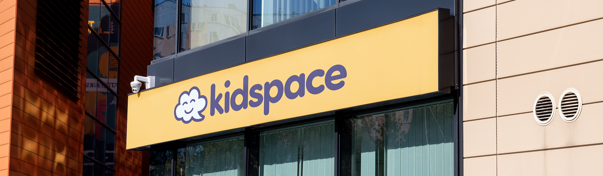
Kidspace
Brand Identity design for a Brisbane-based paediatric speech therapy clinic, designed to be welcoming to children and reassuring to parents.
the Concept
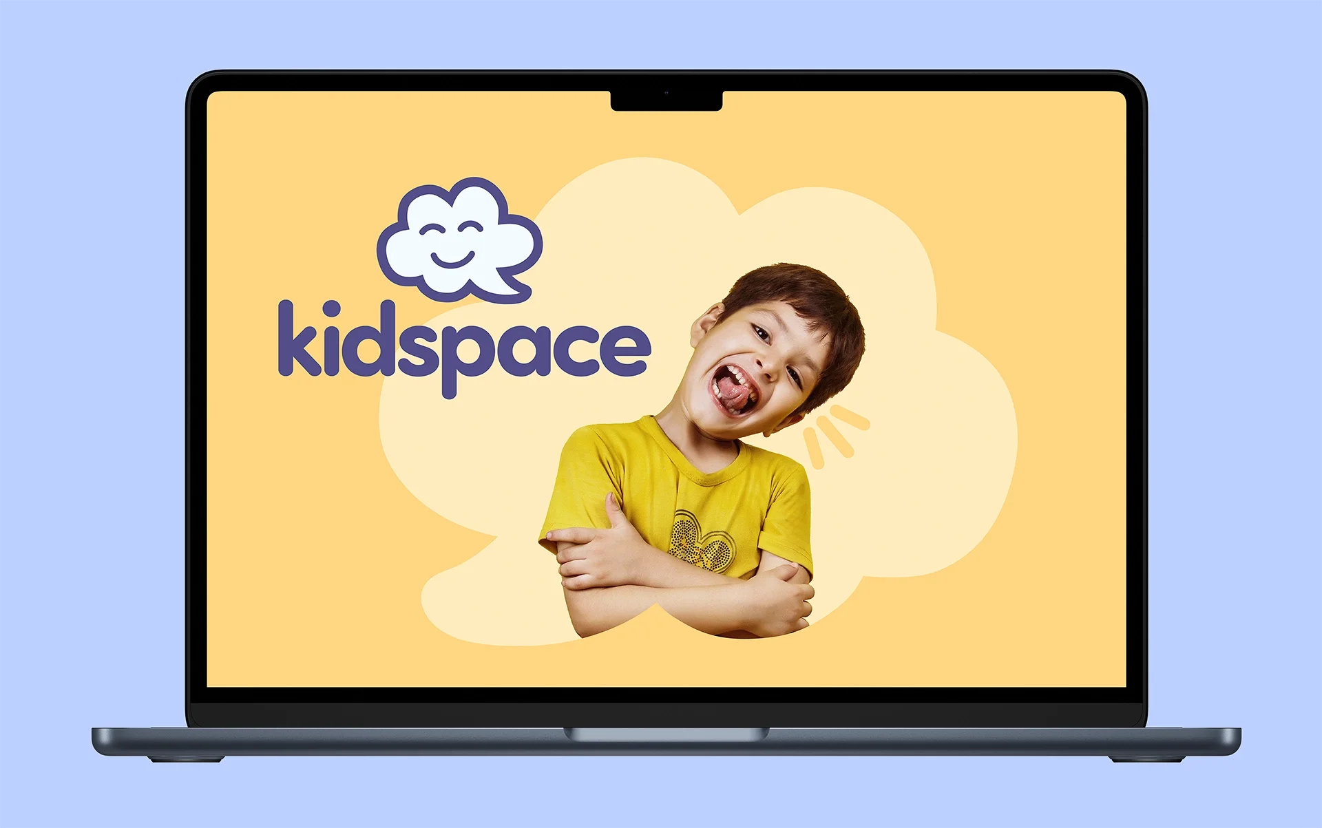
Kidspace needed to feel like a place kids actually want to go. The identity centres around a cloud-shaped speech bubble character: part thought bubble, part speech bubble, representing imagination, communication, and the joy of finding your voice.
The rounded sans wordmark and character illustration work together to create a warm, approachable feel without being childish. Each element was crafted to reflect connection, progress, and positive development.
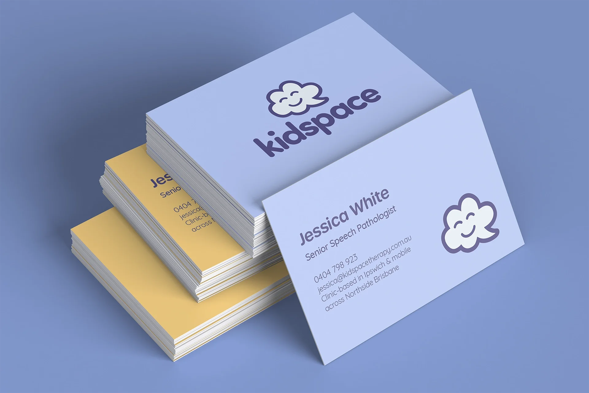
Logo System
The Kidspace identity is designed to live on the brand's two core colours, or white if necessary, but never on dark backgrounds. Both the horizontal and stacked lockups are interchangeable depending on the format and application, giving the brand flexibility while maintaining consistency.
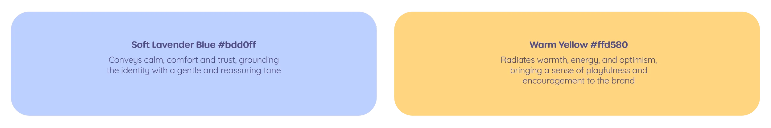
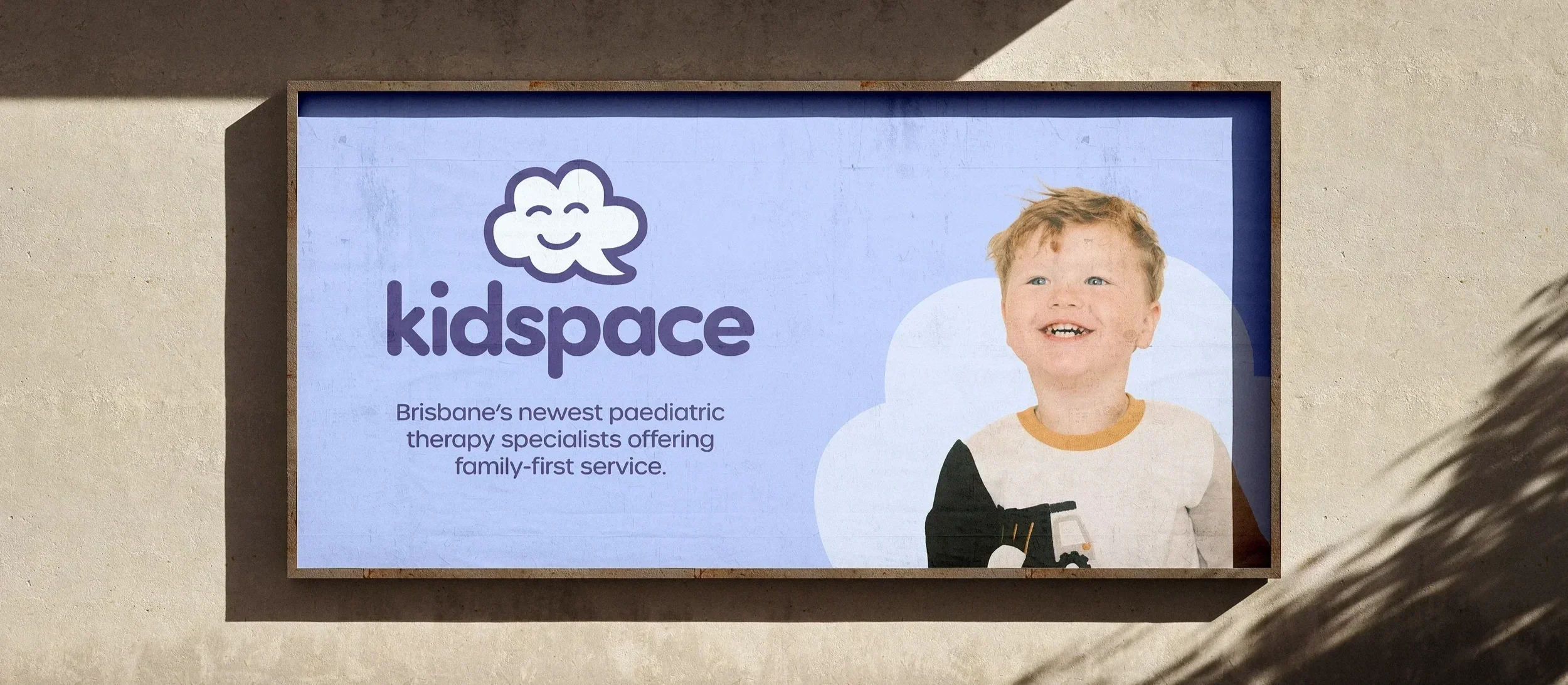
Colour palette
Both colours are designed to work interchangeably as a background or in harmony together, giving the brand flexibility across touchpoints while maintaining a consistent and cohesive feel.

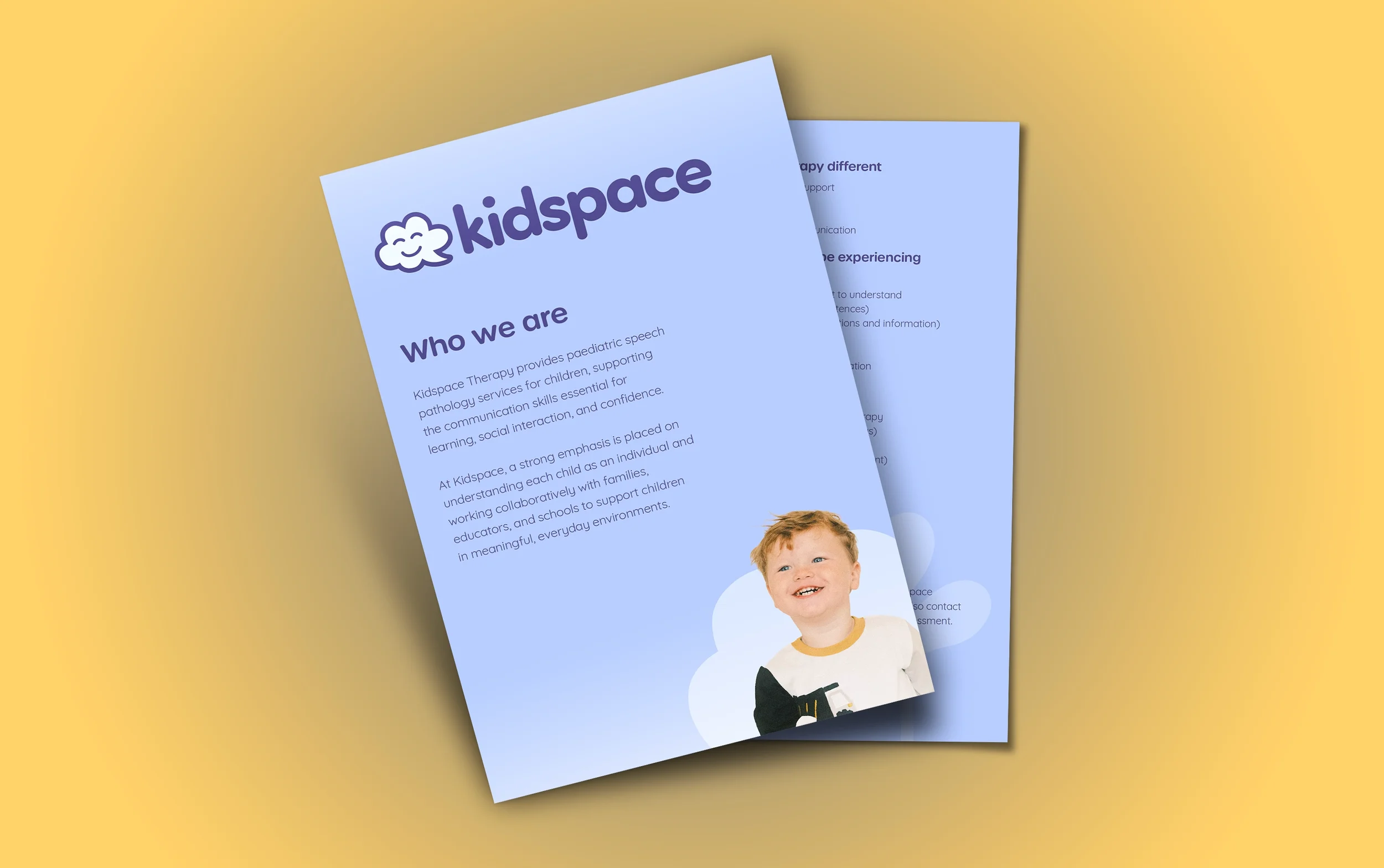
Typography
Urbane Rounded Demi Bold leads the hierarchy with friendly confidence, while Quicksand Regular keeps body text light and readable. Both typefaces share a rounded, open quality that reinforces the warmth and approachability of the Kidspace identity.