SWEETIES
Brand identity and packaging design for a range of healthy soft drinks aimed at kids, built around a cast of retro, video game-inspired characters.
the Concept
Most soft drinks marketed to kids are loaded with sugar, artificial flavours and ingredients that do more harm than good. Sweeties set out to change that, by creating a genuinely healthy soft drink for kids made with real fruit flavours and nothing artificial. The challenge was making healthy feel exciting.
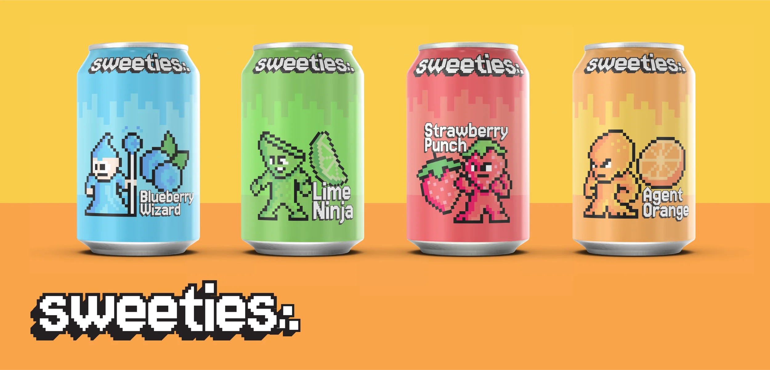
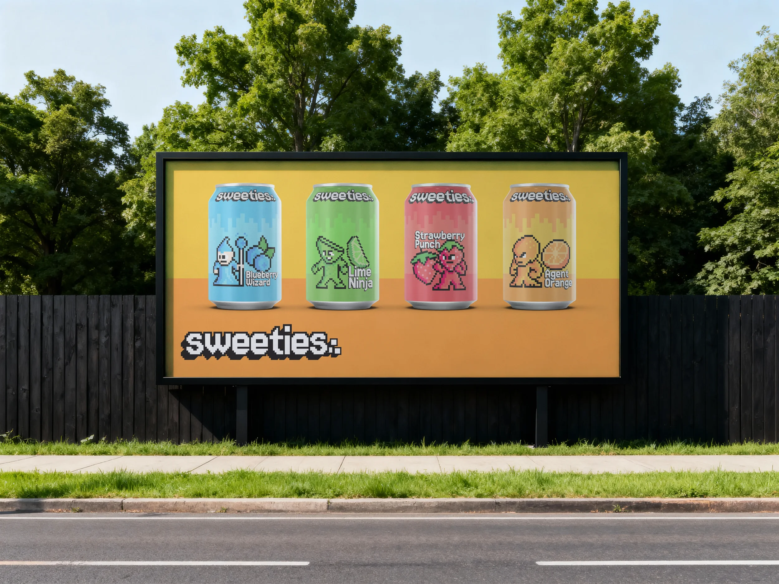
The visual identity needed to steal kids' attention and give them a reason to choose something better. The solution was a retro aesthetic: pixel art characters, a chunky video game-inspired wordmark, and bold flavour colours that feel more like choosing your fighter than picking a drink. Each flavour has its own collectible personality resulting in a brand that looks like it belongs next to a gaming console, not in a health food aisle.
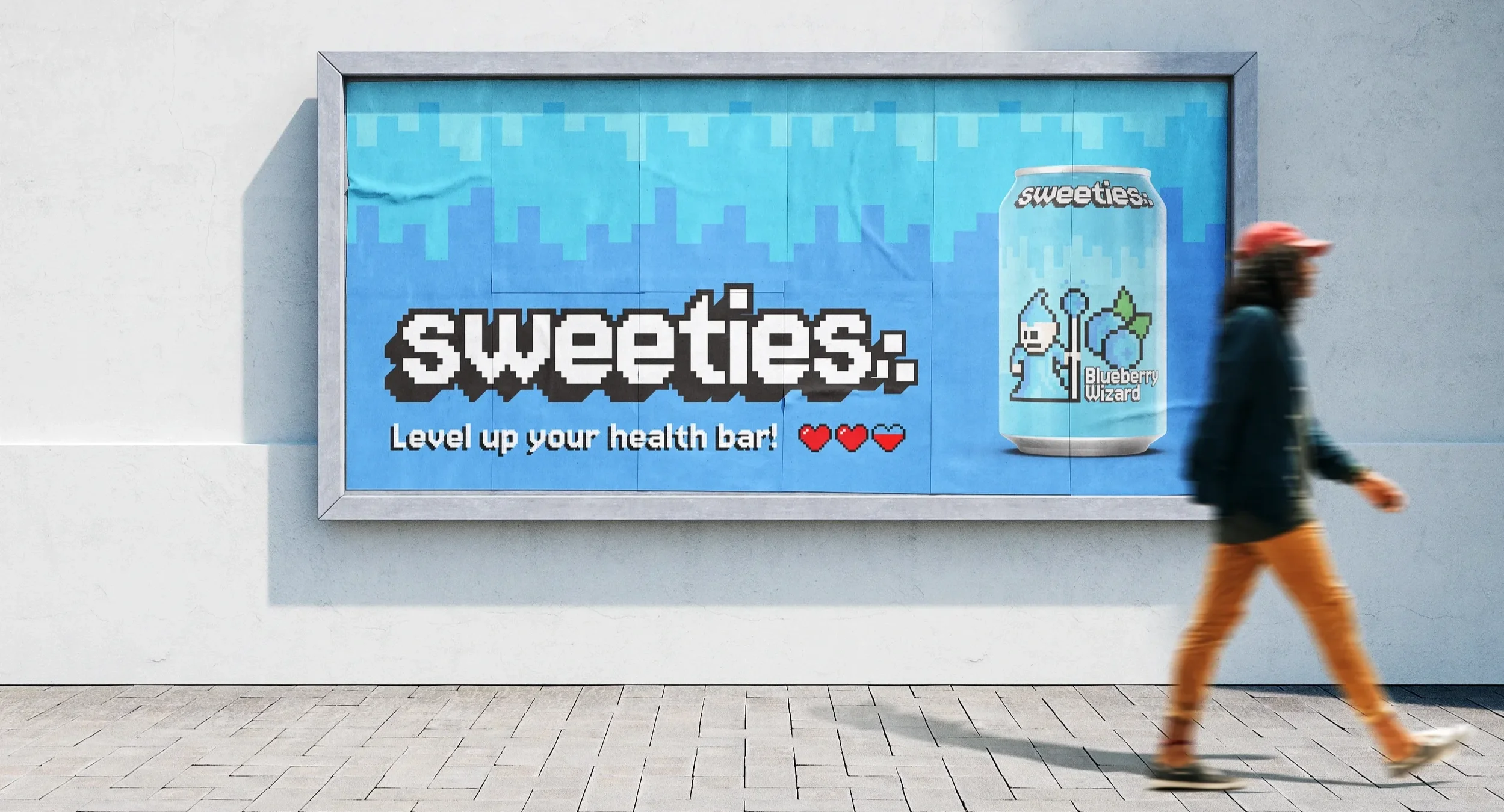
Logo System
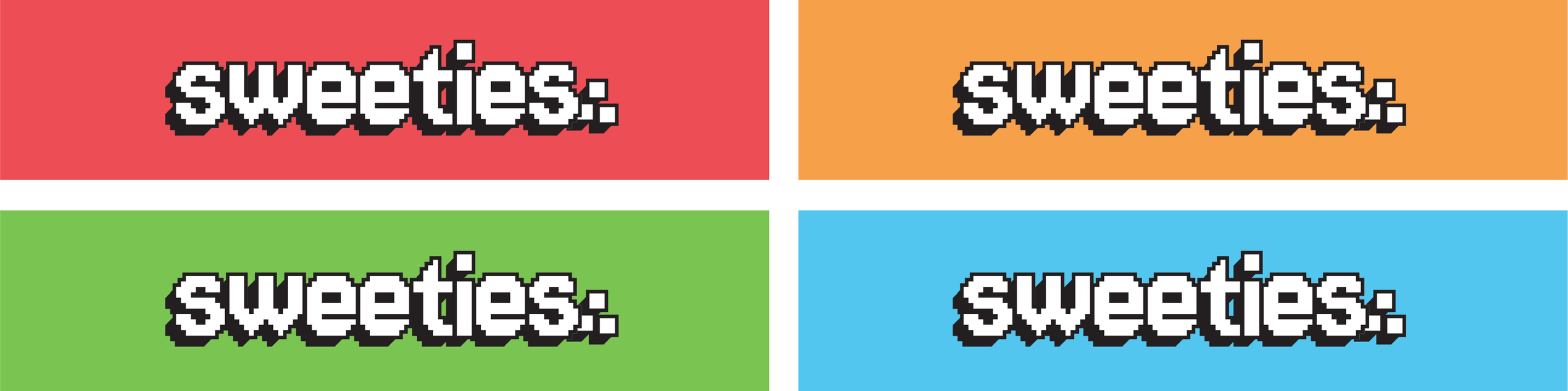
The Sweeties wordmark is designed to feel like it belongs on a game cartridge or arcade cabinet. Bold, chunky and instantly recognisable, it lives exclusively on the four brand colours, never on white or black, keeping the identity energetic and consistent across every application.
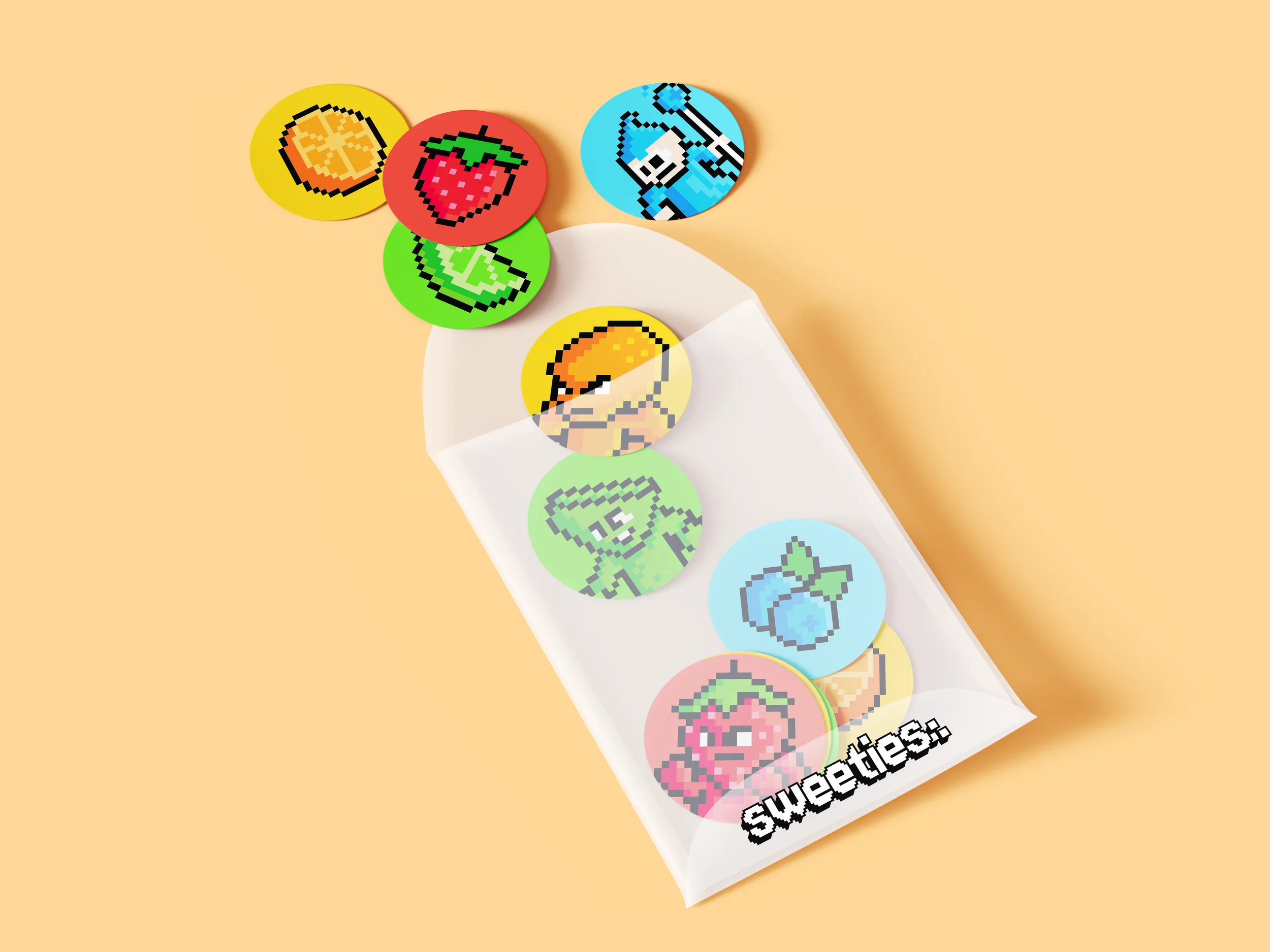
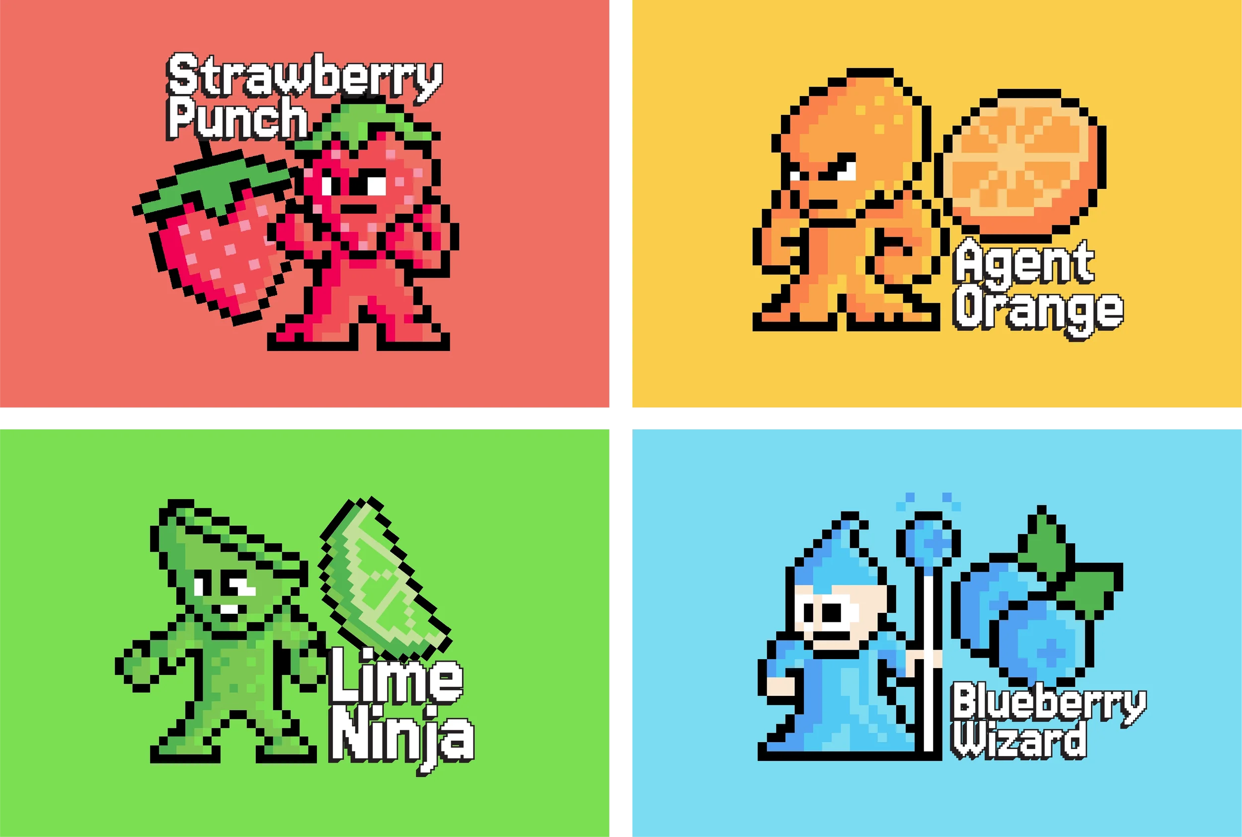
The Characters
Each Sweeties flavour has its own pixel art character, a collectible personality that gives kids a reason to pick a favourite and keep coming back.
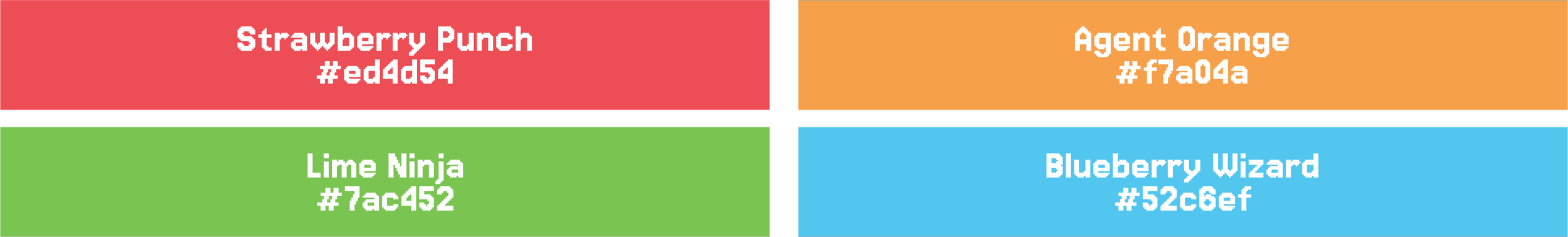
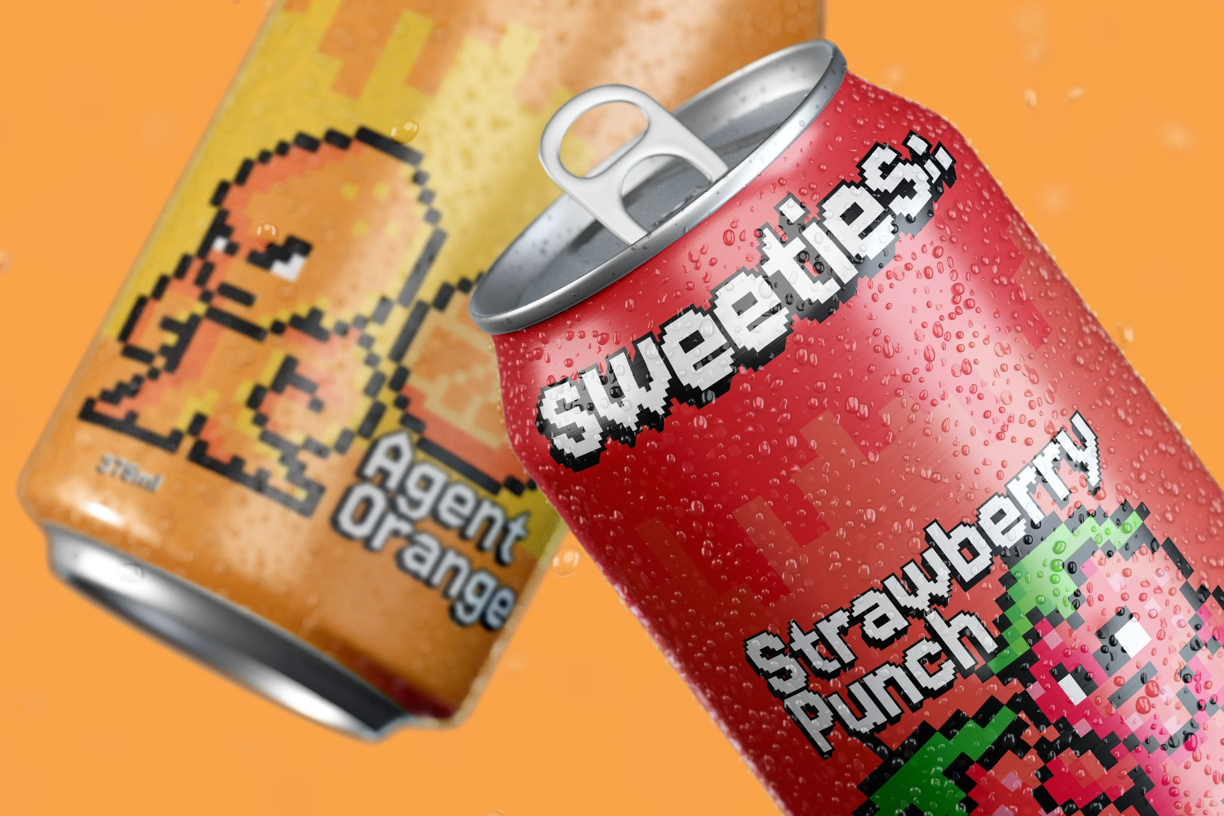
Strawberry Punch, Agent Orange, Lime Ninja and Blueberry Wizard.
colour palette
The four primary colours map directly to each flavour and mascot character of the brand. The palette was chosen to be visually distinct on the shelf, immediately communicating each flavour whilst maintaining cohesion across the range.